
TBM 350: Connecting Dots

As the title of my newsletter suggests, I'm obsessed with the mess of product development. Over the last couple of weeks, I've spent a lot of time with operations leaders trying to bring some order to that mess. They show me mad-scientist Miro boards, sprawling spreadsheets, Jira dashboards, and carefully written docs.
And they ask questions like:
What should we put into our various systems?
Why does no one ever like the roadmaps we show?
Why does our leadership team have so much trouble understanding what's happening?
Why do our best-intentioned efforts to provide visibility seem to backfire?
How do we deal with the fact that everyone wants simplicity—but the work we're doing isn't simple?
How do I push back against the pressure to force everything into one "mono-process"?
I thought one way to explore these questions is to do what I love: draw some diagrams.
I don't have all the answers (and have many questions), but hopefully, these visuals help explain why wrangling product work can feel so hard—and maybe offer a few ways to make it easier.
Work → Output → Outcomes
Here is a simple graph (or combination of graphs). On the left, we have a standard project-based work breakdown graph. A project is divided into phases, which are then divided into tasks. A phase ends when its child tasks are completed, and the subsequent phase begins when the previous phase's tasks have been completed.
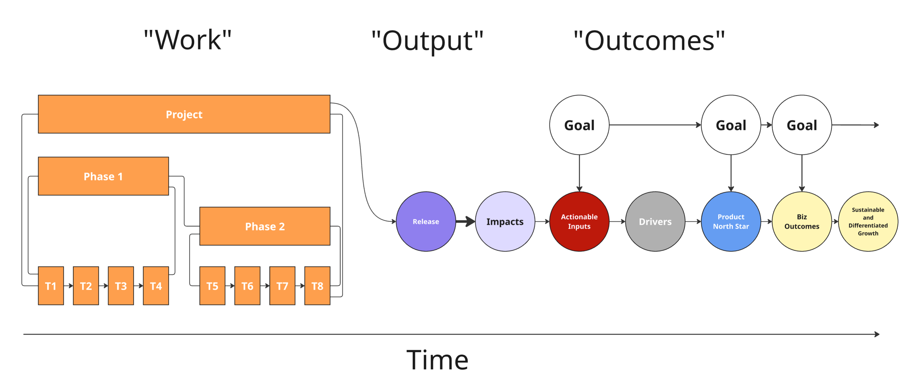
Imagine for a moment that there is only one Release. That Release triggers Impacts, ideally focused on Actionable Inputs. Those Actionable Inputs ideally have a downstream effect on things that matter at different timescales.
The chain on the right (starting with Release) models causation across a series of inputs and outputs. Every link in the chain has embedded assumptions. Some links may be more of a sure thing. Others may involve a big leap of faith.
In technical graph theory terms, the graph on the left is a time-oriented directed acyclic graph (DAG)—a structure commonly used in project planning to represent task dependencies and sequencing. The graph on the right is a causal graph or causal chain characterized by its directional flow with embedded assumptions about cause and effect.
Experimentation Focused Approach
This graph represents a bet-driven, experiment-led model focused on influencing a known Actionable Input. It's less about executing a pre-defined work breakdown (like in the first diagram) and more about exploring pathways toward value.
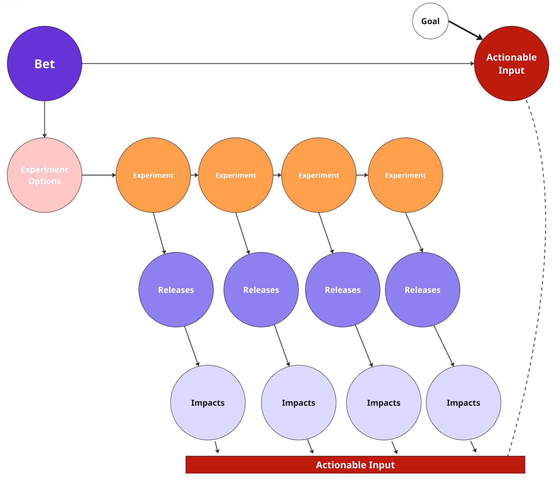
It starts with a Bet—a directional hypothesis about what might move the needle. That bet leads to Experiment Options, representing different approaches or ideas worth testing.
Each Experiment leads to a Release, which may generate observable Impacts. Through this process, the team learns which experiments (if any) meaningfully influence the Actionable Input.
The structure is a causal, exploratory DAG—not a linear execution plan. Each path is a hypothesis test, and only some lead to meaningful impact—capturing the uncertainty and portfolio thinking often missing in deterministic planning. It reflects how real innovation often happens: through a mix of bets, learning, and adapting.
Similar But Different
On one level, these two graphs—the project-to-outcomes graph and the bet-based, experimentation-friendly graph—couldn't be any more different. They represent fundamentally different ways of working.
But suppose you step back and assume that someone felt the project was worth doing and believed moving the Actionable Input was worthwhile. Both involve similar surface-level ideas: a chain of cause and effect and a desire to create impact.
The big challenge comes when teams try to model these distinct approaches using a mono process, forcing them into the same workflow or set of rituals. Imagine a meeting involving these two efforts side by side. Even the language used to describe the work would diverge. You'd approach progress, status, and risk in completely different ways. Treating both as if they flowed through the same pipeline would obscure what matters most.
Wrong But Useful
Step even further back, and you'll notice that, at a very high level, there's a natural flow to almost all our work.
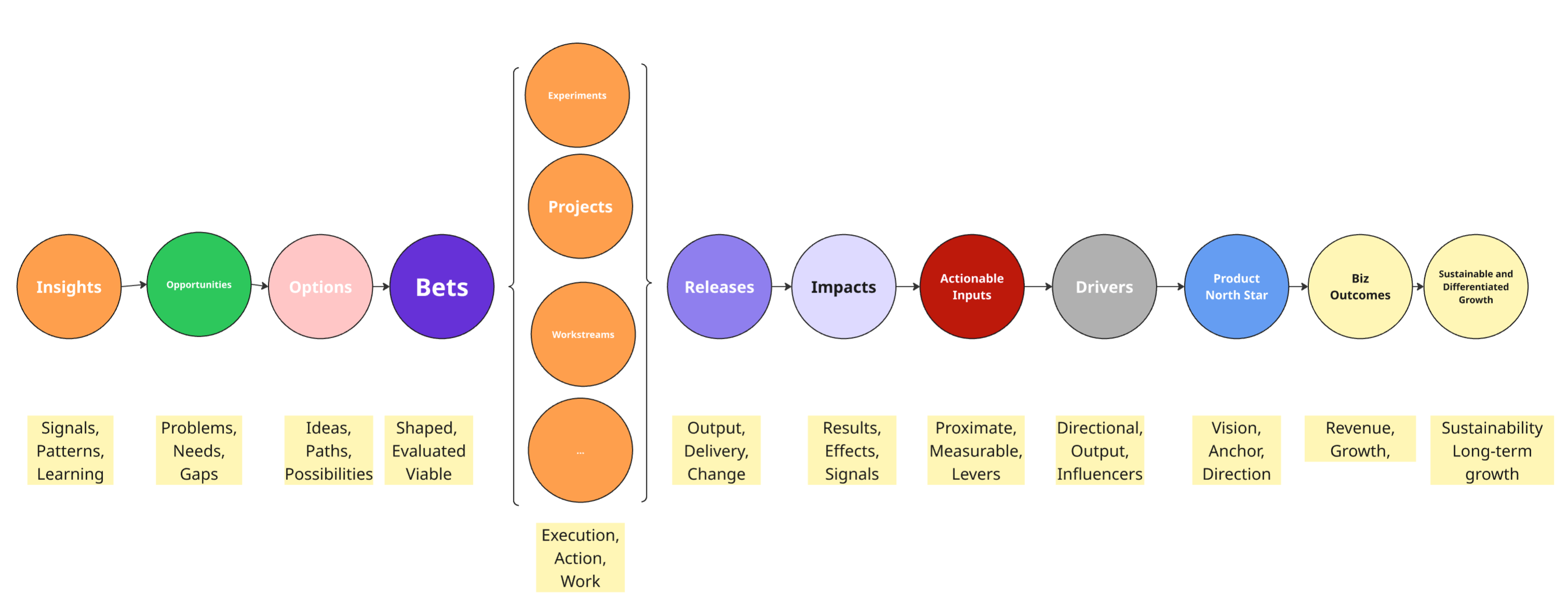
Insights inform Opportunities. We consider different ways to tackle those opportunities—first as broader potential Options, then as more defined Bets. Next, we shift into more execution-oriented work, spanning a spectrum from exploratory Experiments to more rigid Projects. Eventually, we Release something, hoping to generate Impacts against the Actionable Inputs we care about.
Those inputs, through successive hops—Drivers, a Product North Star, and so on—may, if we're lucky, contribute to near-term Business Outcomes. With enough time, coordination, and skill (and a little luck), we might even contribute to sustainable, differentiated growth.
Like any model, this is helpful—but also wrong. It's wrong because:
1. Not all work requires the same depth or approach across these steps (and they're not steps, as we'll explore later).
2. Company culture and experience shape who does what, how they do it, and what they call it.
3. Contextual factors—category, stage, company size, and more—heavily influence how things play out.
For a fun exploration of work shapes (#1 above), check out this video, in which I used AI to simulate 90 projects and cluster them based on key dimensions.
In short, there's some truth in the idea that we observe, orient, decide, and act—or that we learn, build, measure—or diverge and converge across problems and solutions. But when designing your operating system, those framings are only marginally helpful. What matters more is understanding how your system behaves in context.
Layering In Time
Things get much more interesting when you factor time horizons into the equation.
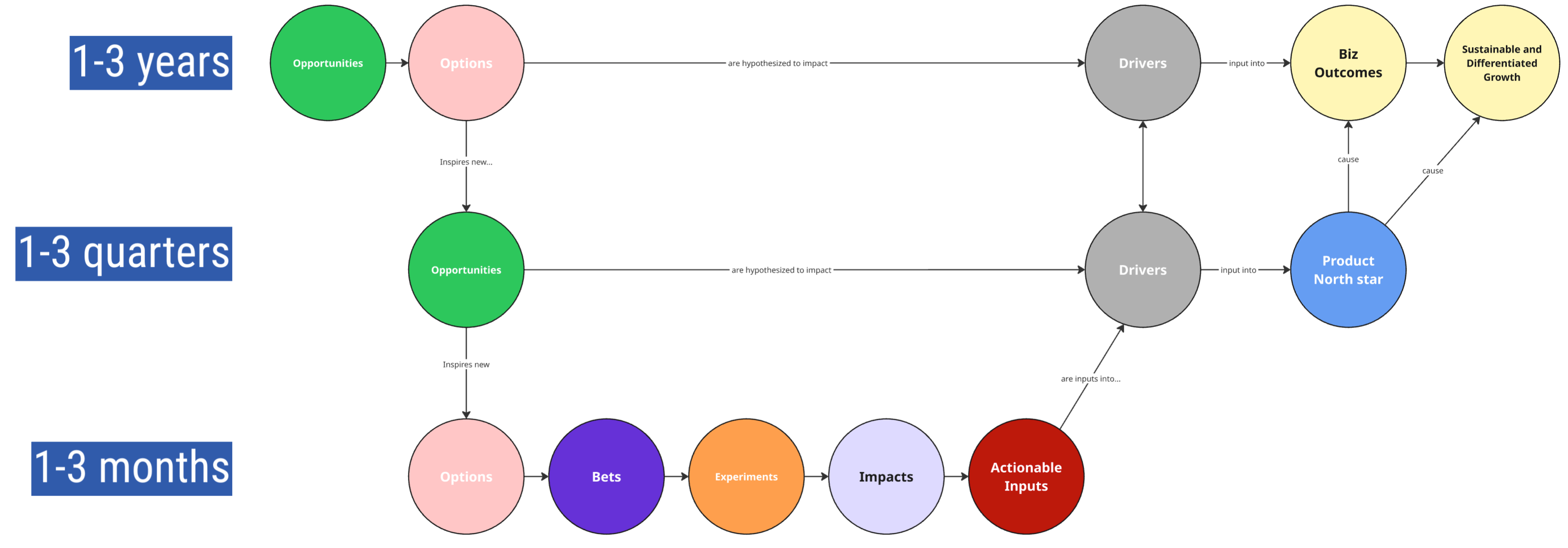
Some strategic Opportunities—like foundational platform capabilities or long-term market shifts—may span 1–3 years. Others might reflect nearer-term chances to improve the customer experience or optimize a sign-up flow in the next few quarters.
An Opportunity in the 1–3 quarter range may inspire a set of shorter-term Options, which in turn inform Bets, Experiments, and ultimately lead to Impacts on a team's Actionable Inputs.
Those team-level inputs are often linked to lagging Drivers, which feed into an even more lagging Product North Star or downstream Business Outcomes.
So rather than a strict "cascade" or a clean left-to-right timeline, you're working with a tapestry of interlocking elements: some are more "work-like," others more "impact-like," and still others focused on possibility, exploration, or sensemaking.
Many strategic frameworks try to tame this complexity through the idea of Horizons (H1, H2, H3). The intent is good—but in practice, people often forget that all the horizons are happening concurrently. There's a constant graduation of longer-term bets into nearer-term work and short-term learnings that reshape what seemed like far-off bets.
Not all strategic bets are 1–3 years, and not all tactical projects are 1–3 months. Some strategies require immediate action, and some projects are inherently slow-burn efforts that span multiple years. Time doesn't always map cleanly to scope or altitude, and that's part of the challenge when designing a system that can handle both.
Messy But Effective
When I work with companies to map out the different spheres of ownership and intent signifiers, they are often amazed by how "complex" the whole thing looks on paper.
Consider these two companies.
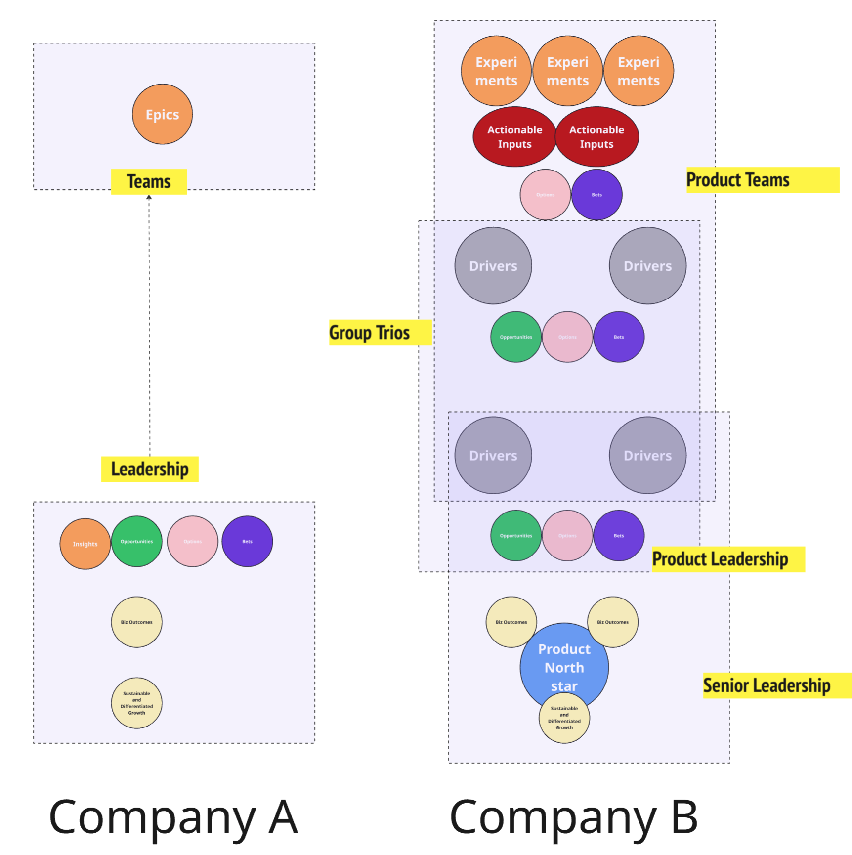
Company A operates with a simple, hierarchical graph—a traditional top-down tree, where leadership "owns" strategy, and teams are primarily executors of work objects like epics. There's a single directional flow of intent, and the system is easy to draw but less fit for purpose in a complex, adaptive environment.
Company B, by contrast, is modeled as a multi-layered, partially overlapping, nested causal graph. It is a more fractal and mesh-like structure. Intent is distributed across multiple layers: Product Teams, Group Trios, Product Leadership, and Senior Leadership. You see local versions of insights, opportunities, options, bets, and drivers—not just at the top but embedded within teams, trios, and leadership layers. Each layer is trying to make sense of its context and act accordingly. That makes it feel dense: you're looking at many partially overlapping intent cycles, each tuned to its scope and horizon.
It looks nothing like the classic pyramid—with vision and strategy at the top and execution at the bottom. But that's because modern product organizations don't work like pyramids. They are mixed networks—where some things flow top-down, some flow bottom-up, causality extends across time, and intent loops through multiple levels before becoming action.
I'm not suggesting that all of these signifiers need to be in systems, but it is interesting to consider what reality looks like (or a closer approximation of it).
Minimally Viable Consistency
To scale gracefully, it is important to decide on the bare minimum of "things" that must be defined and operationalized globally. There are extremes here. Some rapid-scaling tech companies resist any kind of formalization, preferring chaos over the risk of over-training front-line teams. On the flip side, some companies come up with global policies for everything, including SDLC, spring length, discovery practices, operational frameworks, the use of story points (yep, it is a thing), etc.
Teams tend to find ways to shirk or simply sleepwalk through the rules in order to do good work, but that takes a lot of effort and may involve constantly juggling reality with the official way things need to be done.
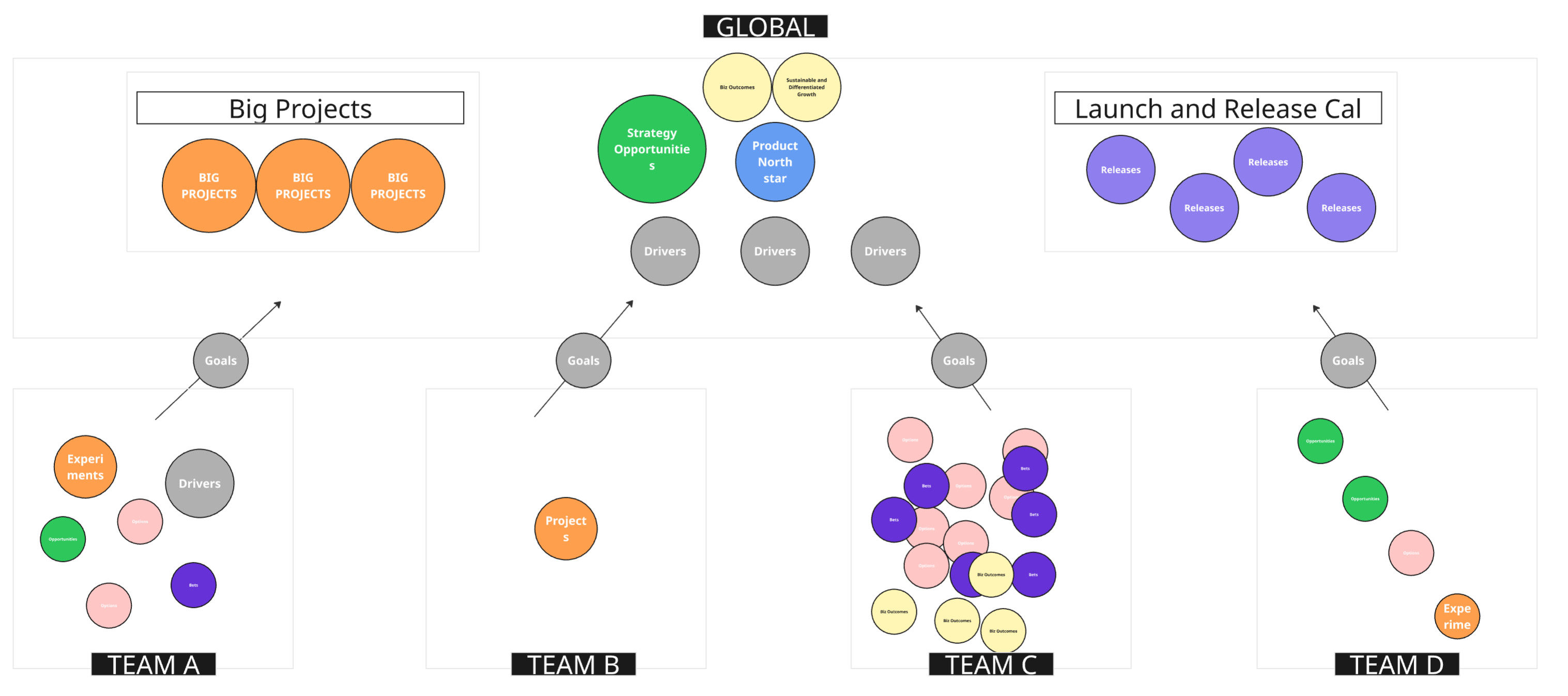
The way around this is to keep the number of globally consistent things to a minimum. You can see in this example that the company decided to keep big, high-dependency projects, high-level strategic opportunities, key drivers, and a Launch and Release calendar more centralized.
Why? Well, when many teams need to coordinate around big projects, they will end up with a common definition and operational flow, whether you like it or not. The drivers are an interface for teams to connect to budgets, priorities, and the product North Star. Perhaps, in this case, the teams do not have fully embedded product marketing, customer success, and support. So, the product development org must standardize how it collectively announces upcoming changes and launches to enable its partners.
The Goals sitting between teams and the global layers are translation layers. They act as interface nodes, turning team-level context (experiments, insights, local projects) into something legible to global structures (big projects, strategy, launch calendars).
Each team or group has its own local intent graph—a mini-version of insights, options, bets, and drivers. These local graphs interlock with one another and occasionally tap into shared global structures (e.g., a North Star or shared business outcome), but they aren't subordinate—they're partially autonomous.
Check out this LinkedIn thread for lots of great comments on the above image.
Non-Virtual Boards
I find it fascinating to compare physical portfolio-level kanban boards with what emerges from most tools. Here is an example board (thank you, Keith Nottonson, who once gave me a tour of this board while he was at Optimizely).
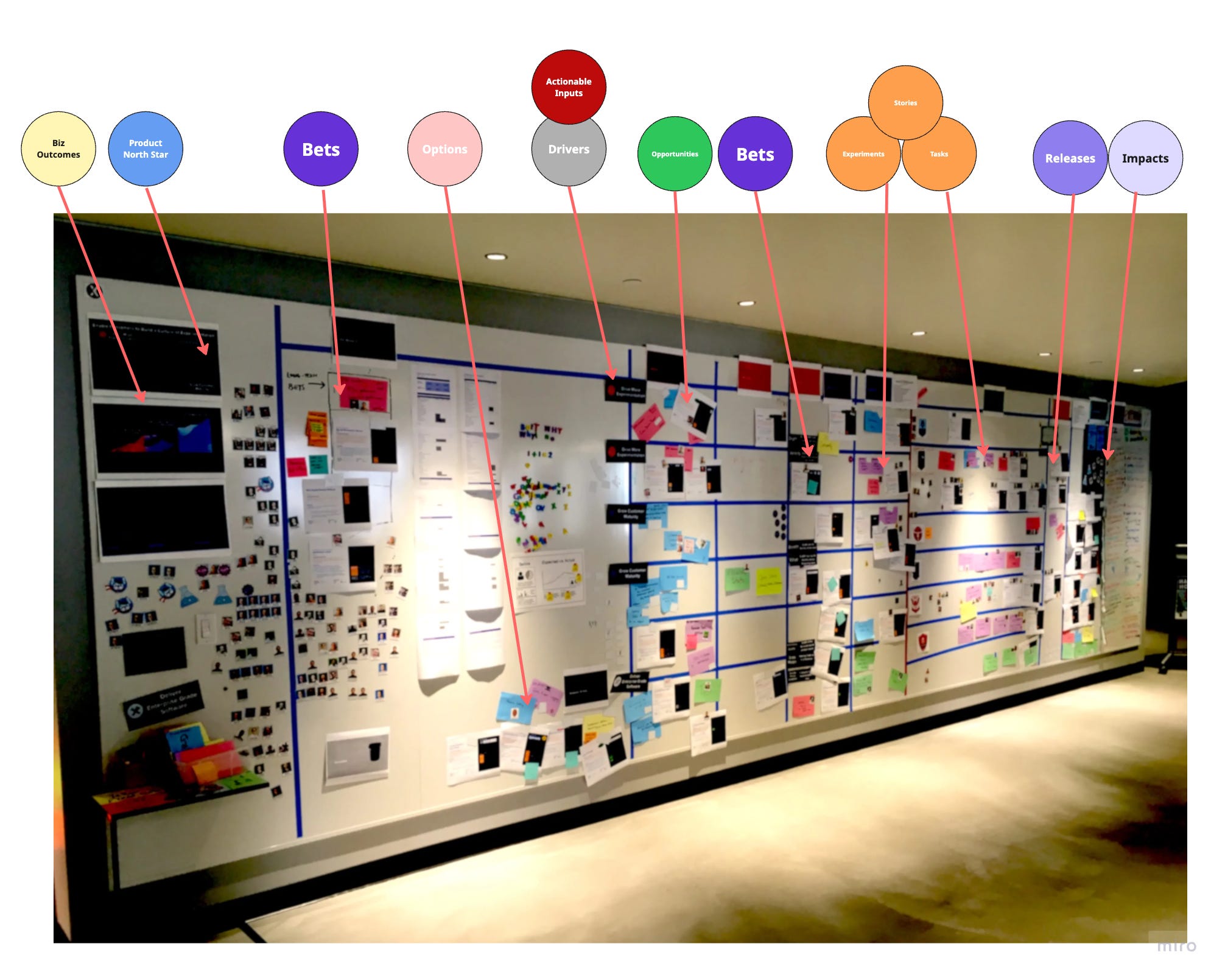
Some observations:
This is a board purpose-designed to enable rituals. People stood in front of this board and had discussions. It would lose most of its impact if you tried translating it into a tool.
Exceptions are everywhere, and that is okay. Purple cards exist alongside blue cards, and cards exist alongside more formal one-pagers with a defined template.
Stickers and other labels are everywhere—experiment beakers, magnets, everything.
It sort of follows a North Star → Drivers → Execution flow. But as you move right into delivery, the neat categories blur. Swimlanes don't cleanly map to outcomes. And that's okay. The structure flexes to hold nuance.
The execution area is proportionally small compared to the upstream discovery and prioritization. It is only marginally larger than the area set aside to the right of the delivery area for experiment monitoring and impact. This shows just how much work is happening that doesn't fit into a ticketing system.
So when you leave humans to their own devices, and you have someone as patient as Keith to maintain a board like this, you end up with something semi-structured, rich with variety and context, and purpose-built to handle the real-world mess of product development.
Perhaps even more interesting: in many company cultures, any effort to create a view that extends above the teams causes an immediate threat response, and people make it go away quickly. It raises too many questions. It feels like micromanagement. "Why isn't our team just left alone?" If you attempt to show reality, and reality makes people nervous, they immediately point out how the board can't scale or how "it is disorganized."
From a graph standpoint, this board is a goldmine:
There's a temporal element (columns roughly represent stages, but not rigidly).
There's work decomposition, but it's fluid and negotiated.
There's causality—bets, experiments, and releases flow toward impact.
Semantic edges and contextualized relationships are inferred by card type, sticker, color, or spatial grouping.
And it's rich in signifiers—a symbolic system layered over the graph.
What emerges is a kind of semi-structured, edge-labeled, time-evolving intent graph—curated, interpreted, and updated by humans—a living system.
And it is very hard to replicate in a tool.
Compression and Legibility
Language and models compress reality. Compression is useful for coordination and memory, but it always loses information. Each of the "dots" and graphs is a shortcut to a category of messy, emergent reality. Sometimes, they're helpful, but they're always lossy.
One of the big mistakes in figuring out your operating system is treating abstract and dynamic things as if they were concrete and fixed. An "Epic" is just a container of intent and collaboration—a shortcut for a conversation. Unless you run a contracting business, you're probably not getting paid for an Epic, like a construction company gets paid for a construction project. Once that Epic ships, you probably won't go back to it. It did its job.
This makes it all the more strange that companies use Epics as some kind of operational signifier—like a part rolling off a production line.
A release or a launch is real. It happened.
A customer interaction is real. A purchase is real.
Many of these other things are not real.
Models like this are representations. They help us make sense of things, but they are not the things themselves.
James Scott, author of Seeing Like a State, distinguishes how the state tries to simplify and standardize reality to make it administratively readable (legibility) from Mētis—the local, experiential knowledge people develop to navigate complex environments. There's always a tension in companies between two real, important needs:
The ability to connect the dots, "see the big picture," compare things apples-to-apples, make smart tradeoffs, quantify investments and returns, and understand the business's overall health.
The ability to encourage and support local variation—to let teams work in ways that make sense for their context, problem space, and maturity.
As discussed earlier, there are also practical limits to expecting everyone to work the same way or follow the same process. In many cases, "following the process" is just people phoning it in—checking a box while quietly doing what they need to do locally.
Some Advice / Thoughts
Start with rituals, behaviors, and interactions before worrying about what you try to operationalize and codify. Can the right people interact at the right times, in the right ways, supported by the right information?
Be very selective about what you centralize and attempt to make consistent. At the same time, accept that sometimes you'll need to scaffold things to get them under control. Just make it clear to your team that the scaffold is temporary. (Frankly, some companies have the opposite problem—they wallow in chaos because they aren't willing to admit that a little centralization might help.)
Fractal structures—e.g., multiple levels of the organization using terms like bet, opportunity, option, etc.—are extremely helpful. They provide shared language without forcing uniformity and acknowledge the nested, networked nature of real organizational work.
When creating high-level roadmaps, remember that it's all about the audience. You're not going to connect all the dots, and no, you're not going to wrangle every initiative into a single "object" that fits all types of work.
Efforts to visualize reality across teams will often trigger a threat response. It feels logical, but emotions and agendas tend to surface quickly when people feel seen—or exposed.
There may be common physics in knowledge work (e.g., insights → bets → work → release → impact), but that doesn't mean everything should go through the same workflow or involve the same people.
Resist the mental model of a cascade. Once you factor in causality, feedback loops, and the time it takes for outcomes to emerge, most cascade models break down.
Product work is not factory work. Resist the metaphors.
Thanks John for this precious reflection. I think it's fascinating to seek a balance between a certain level of shared semantics, and the diversity that can flourish on top. The question i'm really treying to grapple with is what does it make sense to stasndardize and is it intellectyally honest to provide affordances (such as a definition of what a product unit is, how it connects with others, how they combine into experiences, respond to customer needs... and down to how they connect with teams and capabilities...?)
This is one for the weekend. I am having a nomenclature phase - have you considered aligning your usage of the terms outcome and impact with Outcomes over Output? Activity - Output- Outcome - Impact. Based on the value exchange.